| Limited Reserves 1983 - 2003 and more importantly 2003 - 2008 |

| Steven M. Reff Economics Lecturer University of Arizona (2007 - 2016) The 2015 University of Arizona Five-Star Faculty Award |
Whether or not the standalone Limited Reserves graph is acceptable
on the May 2026 AP Macroeconomics exam is up to the AP
Macroeconomics Development Committee.
Because I am teaching CLEP students who do not have to draw
graphs, I find this is a much better way for the students to be able
to answer any multiple choice questions that come their way in
regards to limited reserves.
I find it much easier and more informative than the "Zoro graph"
that tries to compare apples to oranges when showing the
Limited Reserves Framework compared to the Ample Reserves
Framework on just one graph.
on the May 2026 AP Macroeconomics exam is up to the AP
Macroeconomics Development Committee.
Because I am teaching CLEP students who do not have to draw
graphs, I find this is a much better way for the students to be able
to answer any multiple choice questions that come their way in
regards to limited reserves.
I find it much easier and more informative than the "Zoro graph"
that tries to compare apples to oranges when showing the
Limited Reserves Framework compared to the Ample Reserves
Framework on just one graph.
Shown below is a 9-minute YouTube video explaining how the
DR = PCR was still BELOW the PR = FFR much of the time between
1982 - 2003. According to Jane Ihrig's graph in 2016, Limited
Reservesstarted in 2003 when the Discount Rate (DR) was
discontinued andreplaced by the Primary Credit Rate (PCR).
ENLARGE THE YOUTUBE VIDEO BELOW:
DR = PCR was still BELOW the PR = FFR much of the time between
1982 - 2003. According to Jane Ihrig's graph in 2016, Limited
Reservesstarted in 2003 when the Discount Rate (DR) was
discontinued andreplaced by the Primary Credit Rate (PCR).
ENLARGE THE YOUTUBE VIDEO BELOW:


The graph below is a similar graph that will be described in the
YouTube video below. In fact, if you notice, this standalone Limited
Reserves graph looks very similar like the Money Market graph that
should RIP. This graph below seems much easier to teach, much
easier to understand, much easier to show shifts, and most
importantly, much easier to show the change in the spread between
DR = PCR and PR = FFR.
YouTube video below. In fact, if you notice, this standalone Limited
Reserves graph looks very similar like the Money Market graph that
should RIP. This graph below seems much easier to teach, much
easier to understand, much easier to show shifts, and most
importantly, much easier to show the change in the spread between
DR = PCR and PR = FFR.
This lesson can be used by students and economics educators in
learning about and teaching the standalone Limited Reserves graph.
learning about and teaching the standalone Limited Reserves graph.
NOTE: I find that the minor changes I made to Jane Ihrig's Limited
Reserves graph (2016) below gives students a better grasp of the
Limited Reserves Framework that began in 2003.
Reserves graph (2016) below gives students a better grasp of the
Limited Reserves Framework that began in 2003.
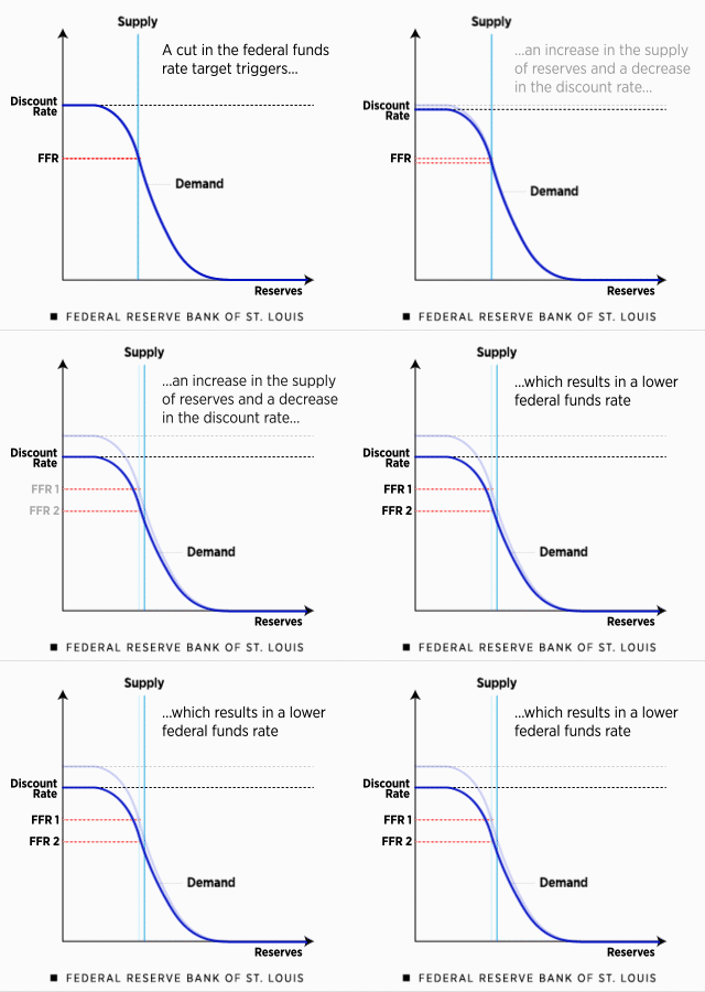
Watch this "Zoro" gif
animation carefully.
Notice the writing states the "increase in
supply of reserves" occurs, yet the way
this gif animation was created makes it
look like Demand decreases, but
in reality the quantity demanded changes
along the new supply curve.
Also, notice nothing happens to the
horizontal portion of the demand curve
along the x axis, which represent the
Ample Reserves Framework. Why this
section of the graph is shown on a
Limited Reserves Framework graph is
still unknown to me.
animation carefully.
Notice the writing states the "increase in
supply of reserves" occurs, yet the way
this gif animation was created makes it
look like Demand decreases, but
in reality the quantity demanded changes
along the new supply curve.
Also, notice nothing happens to the
horizontal portion of the demand curve
along the x axis, which represent the
Ample Reserves Framework. Why this
section of the graph is shown on a
Limited Reserves Framework graph is
still unknown to me.
Hope these three lessons on the history of the Limited Reserves
Framework helps you understand this section of the "Zoro graph,"
graph that The College Board requires you teach. Personally,
I would separate this graph into two separate graphs -- Limited Reserves and Ample Reserves.
https://reffonomics.com/limitedreserves1.html (1979 - 1982)
https://reffonomics.com/limitedreserves2.html (1983 - 2003)
https://reffonomics.com/limitedreserves3.html (1993 - 2008)
Framework helps you understand this section of the "Zoro graph,"
graph that The College Board requires you teach. Personally,
I would separate this graph into two separate graphs -- Limited Reserves and Ample Reserves.
https://reffonomics.com/limitedreserves1.html (1979 - 1982)
https://reffonomics.com/limitedreserves2.html (1983 - 2003)
https://reffonomics.com/limitedreserves3.html (1993 - 2008)